

Hanging a picture seems simple right up until you’re standing in front of a blank wall, frame in hand, wondering where exactly the nail goes. There’s no single magic formula, but there is a set of principles that quickly become second nature, and they are what separates a polished room from an “almost there” one. Whether you’re styling a living room above the sofa or a bedroom over the headboard, the same few measurements do most of the work.
Height is the most common mistake: hang too high and frames float in a void that makes you crane your neck; hang too low and they crowd the furniture. The 15 guidelines below give you the key measurements for every room, from the eye-level rule to the gap above a sofa, plus the practical tricks, like paper templates and a simple nail formula, that make hanging art far less stressful and much more precise.
Contents
1. 1. Start with the 57-inch eye-level rule
2. 2. Fine-tune the height room by room
3. 3. Leave 6–10 inches between the sofa and the art
4. 4. Resist the urge to hang everything too high
5. 5. Anchor a gallery wall on one center line
6. 6. Match the art to two-thirds of the furniture width
7. 7. Space multiple frames 2–4 inches apart
8. 8. How high to hang pictures above a bed
9. 9. Mock it up with kraft paper before you drill
10. 10. Choose center, top or bottom alignment on purpose
11. 11. Adapt the height to low or soaring ceilings
12. 12. Factor in how far back you can stand
13. 13. Don’t leave a small frame stranded on a big wall
14. 14. Follow the slope on a staircase wall
15. 15. Let your eye have the final say
1. Start with the 57-inch eye-level rule
Measure from the finished floor, not from the top of a baseboard or rug.
The core principle museums have used for decades is simple: art should be viewed eye to eye, or close to it. The ideal height puts the center of the frame between about 57 and 65 inches (145–165 cm) from the floor, roughly the sightline of an average standing adult, with 57–60 inches the most common starting point. This gallery rule gives you a reliable baseline to build every variation on. It means your eye lands naturally on the image without any effort.
That said, don’t treat this number as gospel: your living room isn’t a museum, and not everyone in your home is the same height. If your household is mostly tall people, nudge it up slightly; in a home where kids are the main audience, hanging lower makes sense. The goal is always the same: an easy, natural meeting between eye and image. This reference height works especially well for a single frame on an open wall, where no furniture gets in the way.

1. Matisse prints in thin oak frames grouped at eye level above a pair of round side tables © Lama Factory
The beauty of this approach is that it works in most situations and creates consistency as you move from room to room. The eye finds its bearings, and frames look like they belong rather than drifting in some random zone. For a quick check, stand at a normal viewing distance and see whether your chin stays level with the floor. If you have to noticeably tilt your head up or down, measure again and adjust.
Here’s how to turn the rule into a nail position. Measure the height of the frame and divide it by two. Then measure the distance from the hanging hardware (the wire pulled taut toward the top, or the sawtooth or D-ring) down to the top edge of the frame. Your nail goes at 57–60 inches (145–152 cm), plus half the frame’s height, minus that hardware distance. For a 24-inch (61 cm) tall frame whose wire tightens 3 inches (7.5 cm) below the top, that’s about 57 + 12 − 3 = 66 inches (168 cm) from the floor. Write the numbers down before you pick up the hammer; it saves a lot of patching.
2. Fine-tune the height room by room
Every room has its own way of being used, and hanging height should reflect that. In a hallway, where you walk by standing and often in a hurry, the eye-level rule applies fully, sometimes even a touch higher. A home office is different, since you spend hours sitting and looking at a screen or papers. There, art works better a few inches lower so it stays in your peripheral vision.
The dining room is an interesting case: you sit during meals but stand while setting the table or chatting at the end of the evening. A compromise works best, usually with the center of the frame around 57 inches (145 cm), which suits both positions. The entryway is trickier because it’s a transition zone where your eye sweeps quickly across the walls. A standard height works well here, but an arrangement that steps down toward a console table can feel especially welcoming.

2. A tidy grid of four architectural photos hung just above a long, low walnut console © Cabane Déco
The kitchen deserves a mention because it mixes standing work zones and sometimes a seating area. Art is less common there but entirely possible, as long as it’s placed away from splatters and steam. Don’t forget the bathroom either: it’s often overlooked but perfectly suited to framed art if it’s protected from direct moisture. Since you’re constantly switching between sitting and standing there, a middle height of around 59 inches (150 cm) is a safe bet.
In entryways and mudrooms, think about what sits in front of the wall too: coat hooks, a bench or a console all change where the eye naturally lands. A mirror at eye level by the front door is both practical and a nice way to bounce light into a dark entry.
3. Leave 6–10 inches between the sofa and the art
The sofa is probably the piece of furniture that most influences where art goes in a living room, and the relationship deserves your full attention. The generally accepted rule is to leave 6–10 inches (15–25 cm) between the top of the sofa back and the bottom of the frame or arrangement. That gap gives both pieces breathing room so they relate to each other without overlapping or feeling disconnected. Too tight and it looks cramped; too loose and the link breaks, leaving the frame stranded up high.
Sofa back heights vary a lot from one model to the next, and that changes the whole calculation. A low Scandinavian-style sofa frees up more wall and can handle larger art or taller arrangements. A tufted model with a high back calls for more modest sizes, or a slightly higher hang, to avoid everything feeling squashed. Always measure with the sofa in place, not before it’s delivered, because a couple of inches between the plan and reality can throw off your whole layout.

3. Two abstract prints sitting a hand’s width above a gray sectional on a sage green wall © Miliboo
Also keep in mind that the people sitting on that sofa are the main audience for the art above it. Their viewpoint is very different from someone standing, and it’s worth considering. A frame perfectly centered for a standing viewer can feel too high from the cushions, creating a subtle but real sense of imbalance. To find the right balance, sit down after hanging and check that the image is comfortable to look at without raising your eyes too much. For more ideas on styling this wall, see my Scandinavian living room inspiration.
4. Resist the urge to hang everything too high
The most common mistake, the one you see in most homes, is hanging pictures too high on the wall. There are a few reasons we do it: fear of empty space above, the feeling that a high frame looks more important, or simply the habit of looking up at things we value. The result is always the same: a room split into two zones, furniture down low and art up high, with no connection between them.
A frame that’s too high forces your gaze toward the ceiling and creates subtle neck strain when you look at it for a while. Visitors feel a vague discomfort they can’t quite name, which adds to the impression of a poorly arranged room. It gets worse with large pieces, which, hung too high, seem to loom over the space. The fix is often to go 4–6 inches (10–15 cm) lower than your first instinct. It may feel drastic, but it instantly changes how the room reads.

4. A black-and-white aviation photo kept low over a glass-topped trestle desk © Perspectives Studio
To catch this mistake before it’s permanent, use a simple trick: have someone hold the frame at different heights while you look from the spot where you usually see that wall. You’ll likely find that the height that felt right at first now looks too high, and the lower option looks more harmonious. This visual test beats any measurement because it uses your real perception rather than abstract numbers.
If you’ve already hung everything too high, don’t panic. Moving a frame down a few inches is a quick fix: the old hole will usually be hidden behind the frame, or can be filled with a dab of spackle and touched up with paint once it dries.
5. Anchor a gallery wall on one center line
When several frames share one wall, a center line becomes your best friend for structuring the whole thing. This line, usually horizontal, runs through the center of all the frames and sits at the eye-level height mentioned above. Around that imaginary line, formats and sizes can vary, but the common thread keeps the arrangement cohesive. It lets you pair very different pieces while keeping a visual unity that feels satisfying.
Start with the most important or largest frame and hang it first at the standard height. The other pieces then arrange themselves around that anchor, either mirrored for a symmetrical look or more organically for a relaxed result. A center line doesn’t impose strict geometry; it’s an invisible structure that guides the layout. Even in gallery walls that look random, that line is often there, hidden under the seemingly casual mix.

5. Loose cluster of prints, from a large poster to a tiny portrait, above a kitchen cart with tulips © Recollection
To mark the line while you plan, stretch a string or draw a light pencil line you’ll erase later. This physical reference prevents small errors that, added up over several frames, end up creating a visible drift. Aligning centers works especially well with very different frame sizes because it creates order where chaos was lurking. You can also align frames along their top or bottom edges, which produce different effects but are just as valid depending on the look you want.
6. Match the art to two-thirds of the furniture width
A frame above a piece of furniture has a proportional relationship with it that can make or break the whole look. The common rule says art or an arrangement should span about two-thirds to three-quarters of the width of the furniture below. That ratio creates a pleasing balance where the furniture seems to support the art without being overwhelmed by it. Art wider than the furniture below feels precarious, as if the whole thing might tip over.
On the other hand, a tiny frame above a big sideboard looks lost, almost comical. That reverse imbalance leaves a gap the eye instinctively wants to fill, which creates a vague sense of unease. The fix is either a bigger piece or a group of frames whose combined size reaches the right proportions. A grouping is a great way around a single frame that’s too small for the space.

6. One bold black-and-beige abstract centered over a sleek low console and nesting tables © Amadeco
Take time to check the proportions before hanging for good, by propping the frame on the furniture or having someone hold it. This full-size test shows right away whether the size works or needs adjusting. Centering the frame horizontally over the furniture strengthens the link between the two and creates a calm vertical axis. A deliberate off-center placement can work in some contemporary setups, but it takes a confident eye so it doesn’t look like a mistake.
7. Space multiple frames 2–4 inches apart
The space between frames is as important to the composition as the frames themselves: it’s active empty space that structures the group. Spacing that’s too tight smothers the pieces, which lose their individuality in a confusing mass; too loose and the group breaks apart into isolated pieces that no longer talk to each other. The usual recommendation is 2–4 inches (5–10 cm), ideally kept consistent within one arrangement. That regularity creates a visual rhythm that guides the eye smoothly from one frame to the next.
Small frames can handle, and even benefit from, tighter spacing that emphasizes a dense, curated collection effect. Large pieces need more air to breathe and stand on their own within the group. In a mixed arrangement, spacing can vary slightly to suit each piece while keeping an overall sense of order. The eye forgives small variations if it senses an underlying logic.
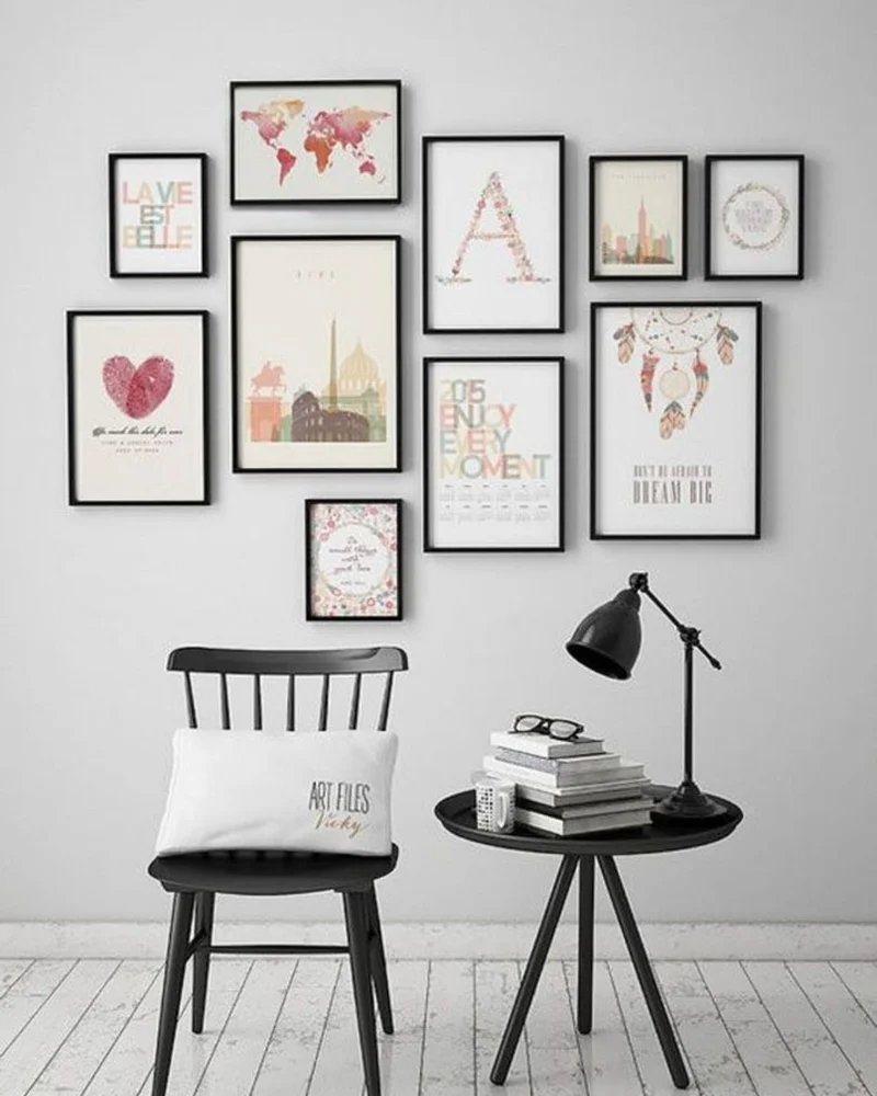
7. Travel posters and typographic prints clustered tightly above a black spindle chair and lamp © Pipcke
To get even spacing without spending hours with a tape measure, cut cardboard spacers to the size you want and slip them between frames as you hang. It’s a low-tech trick, but it gives you consistency you could never get by eye and speeds things up a lot. Once everything is up, remove the spacers and admire the even result, the product of good prep rather than innate talent.
When you’re working with heavier pieces, choose hardware rated for the weight. Light frames can hang on a simple nail or a picture hook, but larger frames and mirrors need wall anchors in drywall or, better, a screw driven into a stud. Two hooks spaced apart instead of one keep a wide frame level and stop it from tipping every time someone closes a door. Renters can often use adhesive picture-hanging strips for lightweight frames; check the weight limit on the package and follow the instructions for the wall surface.
8. How high to hang pictures above a bed
The bedroom has one big difference that changes the rules: you spend most of your time there lying down or sitting on the bed. That position changes your viewing angle and therefore the best hanging height. Art placed at a standing person’s eye level ends up too high for someone propped up on pillows, creating an awkward distance. The solution is to lower everything noticeably, sometimes by 8–12 inches (20–30 cm) compared to the usual standard.
Above the bed it gets trickier, because you need to balance the view from bed with the look of the room from the doorway. A good compromise is usually 8–12 inches (20–30 cm) above the headboard: low enough to stay visible from the pillows, high enough not to loom over the sleeper. This varies with the height of the headboard itself, a key factor that’s too often overlooked. If you’re planning a new one, my DIY headboard ideas can help you picture the whole wall.

8. A soft arched landscape print hung low above the bed in a blush-toned bedroom © Walensky
Side walls visible from the bed follow a similar logic, hung lower to match the horizontal gaze of someone lying down. Always test the height by actually getting into the position you’ll be in most often, book in hand or just relaxing. This real-life check beats any theory and saves you from discovering too late that your art floats out of your everyday line of sight. For more bedroom inspiration, take a look at my Scandinavian bedroom ideas.
9. Mock it up with kraft paper before you drill
Before you grab the drill and make permanent holes, there’s a simple way to preview the final result risk-free. Cut kraft paper rectangles to the exact size of each frame and tape them to the wall with painter’s tape. This full-size mock-up lets you try different layouts, fix heights and adjust spacing with no permanent consequences. The time you spend here pays off right away by sparing you regrets.
This method reveals mistakes you’d never spot on paper or in your head, like asymmetry with an architectural feature or imbalance with the furniture. It also lets you live with the layout for a few hours or days, so you can check it at different times of day and in different light. Professional art installers rely on this technique because it saves them costly, time-consuming fixes once the art is up.
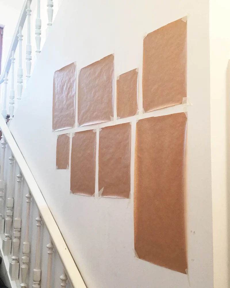
9. Kraft paper cutouts taped along a staircase wall to preview the layout before drilling © Pierre Papier Ciseaux
Mark the exact hanging point on each paper template, usually a few inches below the top edge depending on the hardware. That way you can transfer the nail or screw position straight to the wall once you’re happy with the layout. Going from template to drilling then becomes a formality, done with the calm confidence of knowing exactly where everything goes.
A level is your other essential tool. A small torpedo level set on top of the frame, or a laser level for a large arrangement, catches tilts the eye won’t notice until everything is up. Small rubber or felt bumpers on the bottom corners of each frame help it stay straight and protect the wall.
10. Choose center, top or bottom alignment on purpose
How you align frames with each other gives you several options with very different effects. Center alignment, mentioned earlier, creates a classic, balanced harmony that works almost anywhere. Top alignment creates a strong horizontal line that can visually lower a very high ceiling or structure a large wall. Bottom alignment does the opposite, lifting the eye and adding verticality to the arrangement.
In a gallery wall where sizes vary a lot, strict alignment can feel too rigid and fight the collected-over-time look you’re after. A more organic approach works better, with frames that seem to have been added one at a time rather than installed from a master plan. Even in this apparent disorder, keeping a consistent overall height stops the arrangement from drifting up or down the wall.

10. Four geometric prints in black frames, edges aligned into a crisp square © Cabane Déco
Your choice also depends on your overall style and the impression you want to make. Perfect, to-the-millimeter alignment suits clean contemporary spaces where precision is part of the look. A looser approach fits homes with eclectic influences and proud collections. Either way, the decision should be intentional, not the result of chance or guesswork.
11. Adapt the height to low or soaring ceilings
Ceiling height directly affects how frames should be positioned to make the most of the space. In a room with low ceilings, under 8 feet (2.4 m), hanging frames slightly higher than usual can help stretch the proportions upward. This works especially well with vertical formats that emphasize the lifting effect. Avoid large horizontal arrangements in these spaces, as they reinforce the squat feeling that’s already there.

11. Floor-to-ceiling vintage oil paintings crowding a dark teal wall above two armchairs © Elle
High ceilings, over 10 feet (3 m), pose the opposite problem: so much vertical space that a room can feel imposing or cold. Hanging a bit lower than standard brings the eye back to a more human zone and makes the room feel cozier. Arrangements that stretch horizontally work well here because they anchor the wall without trying to compete with the height. You can also hang pieces at different heights to cover more vertical wall space.
Attic rooms and spaces under sloped ceilings add another layer of complexity, with varying heights within the same room. Here, frame placement should work with the architecture rather than fight it, for example following the slope for a dynamic effect. The lowest areas take smaller pieces, while open sections can handle more ambitious ones. That way a constraint becomes an opportunity for an original arrangement.
In rooms with crown molding, a chair rail or wainscoting, use those lines as references. Frames centered between a chair rail and the ceiling, or between wainscoting and molding, look deliberate and calm, even if the exact height differs slightly from the standard rule.
12. Factor in how far back you can stand
You don’t look at a picture with your nose against the wall, but from a distance that depends on its size and subject. That ideal viewing distance, where the piece truly comes alive, needs to be possible in your room or you’ll be frustrated every day. A large piece in a narrow hallway can never be properly appreciated because you can’t step back far enough. A rough rule suggests a minimum viewing distance of about one and a half times the diagonal of the frame.
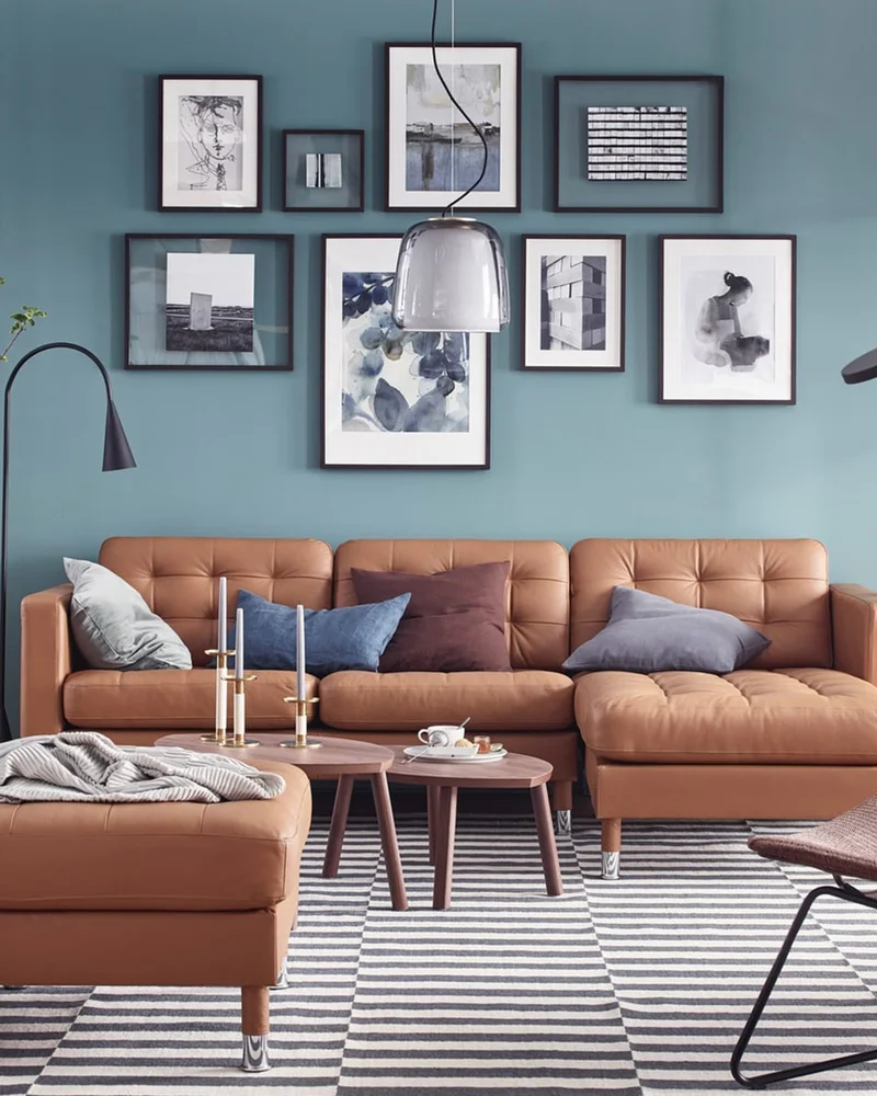
12. Black-and-white gallery wall spread above a cognac leather sectional on a dusty blue wall © Ideat
Viewing distance also affects hanging height, since your angle of view changes with distance. Up close, a frame at eye level looks right; from far away, the same frame can look too low because your field of vision takes in more wall. In large rooms where you see art from several yards away, hanging slightly higher compensates for that perspective effect.
Also think about the different distances you’ll see the art from every day: from afar as you walk in, closer as you pass by, very close if an armchair faces the wall. Each creates a different experience worth considering when you settle on the final height. A smart compromise works for all viewpoints rather than optimizing for one at the expense of the others.
Lighting matters as much as distance. Avoid hanging precious artwork in strong direct sunlight, which can fade prints and photos over time, and watch for glare on glass when a window faces the wall. A picture light above the frame or a well-aimed ceiling spot can make even a simple print look like a gallery piece in the evening.
13. Don’t leave a small frame stranded on a big wall
A small frame alone in the middle of a big wall creates an empty feeling that does nothing for the art or the room. The mismatch between wall and frame feels unfinished, as if something’s missing from the picture. The frame looks lost, unable to hold its own against all that space. No hanging height can fix this basic imbalance: it’s a question of choice, not placement.

13. Sun-bright palm and pool photos gathered above a white slipcovered sofa on an olive wall © David & David Studio
There are several ways to fix this without giving up a small piece you love. The first is to add it to a group of frames that together have enough visual weight for the wall. The second is to hang the small frame above a piece of furniture, which anchors it and visually shrinks the expanse of wall to fill. The third is to move it to a more intimate spot where its modest size fits: an alcove, a wall corner or a narrow passage.
The minimum size for a frame hung alone depends on the wall area and viewing distance. On a wall about 10 feet (3 m) wide, a frame under 24 inches (60 cm) across will struggle to hold its own; on a 3-foot (1 m) stretch of wall between two doorways, the same frame can work perfectly. Thinking in context avoids miscasting a beautiful piece in a spot where it can’t shine.
14. Follow the slope on a staircase wall
The staircase is a fascinating special case where eye level itself moves along with the person going up or down. The usual rule adapts to create a diagonal line that follows the slope of the stairs, keeping each frame at a consistent distance from the steps below it. This creates a rising visual effect that matches the physical movement and turns the stairwell into a real gallery.
To get it right, first picture a line parallel to the slope of the stairs, about 59 inches (150 cm) above each step. That line becomes the center line for your frames, either aligned strictly or arranged more loosely while following the general direction of the climb. Spacing between frames can stay constant or follow the rhythm of the steps to echo your stride.

14. Oak picture ledges stepping up beside a black metal staircase, lined with small frames © Hello Blogzine
Stairs also offer a variety of viewpoints: from the bottom you look up at the frames, from the top you look down, and from the middle at different heights. All these angles sometimes justify hanging slightly lower than the theoretical line to improve the view from the ground floor, which is often where people first see it. Test the different perspectives before you commit to avoid unpleasant surprises.
15. Let your eye have the final say
Once you’ve absorbed all these principles and measurements, it’s time to trust your own perception over the numbers on the tape measure. Visual balance, that feeling that something works or doesn’t, becomes your most reliable tool once you know the basics. A frame can follow every rule on paper and still look oddly off; and a placement that bends the rules slightly can look perfectly right.

15. Green botanical prints in natural wood frames above a low bench, vases and baskets © But
The rules in this post aren’t absolute constraints but starting points, guardrails that keep you away from obvious mistakes and point you toward proven solutions. Once you’ve mastered them, you’re free to adapt them, sometimes bend them, and create your own codes knowingly. The goal is always the same: a wall that feels like you, where your frames look like they’ve always been exactly where they belong.
So grab a pencil, a tape measure, some painter’s tape and a level, and give yourself permission to experiment. Start with one wall, apply the basic rules, step back, adjust, and let your eye guide the final decision. Once you’ve hung one wall well, the rest of the house becomes much easier.
Frequently asked questions
What is the rule for how high to hang pictures?
The most common guideline is to hang art so its center sits about 57–60 inches (145–152 cm) from the floor, which is roughly eye level for an average adult. Galleries and museums use this standard because it’s comfortable for most people. Adjust slightly for your household, ceiling height and furniture.
How high should a picture be above a couch?
Leave about 6–10 inches (15–25 cm) between the top of the sofa back and the bottom of the frame. For a sofa with a back around 32 inches (80 cm) tall, that puts the bottom of the frame roughly 38–42 inches from the floor. Aim for art that spans about two-thirds of the sofa’s width.
How high should you hang a picture above a bed?
Plan on about 8–12 inches (20–30 cm) above the top of the headboard. That keeps the art visible from the pillows without looming over you, and it connects the piece visually to the bed. Hang it centered over the bed, especially with a single large piece.
How far apart should pictures be in a gallery wall?
Keep 2–4 inches (5–10 cm) between frames and try to stay consistent throughout the arrangement. Smaller frames look good with tighter spacing, while large pieces need a bit more room. Cardboard spacers make it easy to get even gaps.
Should pictures be hung higher with high ceilings?
Not much. Keep the center close to eye level so the art relates to people and furniture, but you can go slightly higher (up to about 67 inches/170 cm at center) or use taller arrangements to fill more wall. With low ceilings, stick to the standard height and favor vertical pieces.